Abstract: Japan has a pervasive and problematic history based on design by consensus and speculative labor for the design of past Olympic Games as much as for the upcoming Games. The 2020 Games have been defined by design competitions, events where individuals volunteer to create visual graphic works without financial reward for the time and labor spent. This devaluation of creative work helps explain why Tokyo is swathed in mediocre Games-related visuals.
Japan has a pervasive and problematic history based on design by consensus and speculative labor for the design of past Olympic Games as much as for the upcoming Games. The Olympics is theoretically predicated upon the notion of competitive sport, but the case may be for the 2020 Tokyo Summer Olympics that the ethos of the creative labor behind the Olympics is predicated upon speculative labor. To be more specific, the 2020 Games have been defined by design competitions, events where individuals volunteer to create visual graphic works that are submitted without pay, are judged, and for most contestants do not result in financial reward for the time and labor spent.
One of the assorted sites where the Olympic and Paralympic Games will be held in Japan’s cultural, financial, and governmental capitol, the New National Stadium, is the result of a contentious series of architectural competitions. Unlike graphic design, architectural competitions are standard practice within the field of architecture. These competitions involve groups of architectural practices who are invited to pitch against one another, with the winner taking all. The competition for Tokyo’s Olympic Stadium was initially won by late British architect Zaha Hadid, then wrested away and awarded to Japanese architect Kengo Kuma in another architecture competition (Murai, 2015) just prior to Hadid’s passing.
The notion of the design competition has historically not been the norm for sectors of design production other than architecture globally, yet the recurring Olympic events hosted in Japan deviate from that standard. Nearly every instance of the Olympics occurring in Japan has seen the design of the Olympics involve a certain amount of speculative labor.
The upcoming Olympics represent a shiny-seeming new standard of Late Capitalism in regard to creative labor: the graphic design endeavors associated with the Games extracted a phenomenal amount of labor from everyday people for the most minimal financial reward in as short a time as possible.
The design of the 2020 Olympics was very much in line with exploitative labor practices that have been consistently associated with the Olympic Games since their first popularization in Japan.
Tokyo 1940: The Case of the Disappearing Olympics
Japanese athletes began participating in the Olympic Games in 1912 and first won gold medals in Amsterdam in 1928. The introduction of physical education and sports helped to modernize the Japanese educational system. The inclusion of this curriculum also served a symbolic function—the body as one unit of the aggregate nation state. Keeping one’s self fit was a stand-in for the health of the nation and its interests. (Collins 2007, 961)
Tokyo was initially supposed to have held the Games in 1940, officially known as the 12th Olympiad, and the Games would coincide with the 2,600th anniversary of the rise to power of Japan’s first emperor, Jimmu, as well as help reify international recognition of Japan as a now-fully-emerged international superpower. With the halcyon days of the Taisho Democracy now only a faint memory in the eyes of the domestic populace, hosting an international event such as the Olympics would only serve to boost Japan’s international reputation and support the nation’s imperialist colonial agenda of rapid expansion.
In 1932, Tokyo entered the competition to host the games, competing against a host of European cities for the right to hold the event. Japanese members of the International Olympic Committee, including ambassador Sugimura Yōtarō, met behind the scenes with other IOC representatives to engineer deals to help secure Tokyo’s candidacy throughout the early 1930s, resulting in Tokyo’s selection as the site of the 1940 Olympics in 1936 with Sapporo simultaneously being chosen as the site for the fifth Winter Olympics that same year. (Collins 2007, 959)
Planning for the Games had already begun in earnest in terms of programming, organizing, sites, transportation, and promotion. The Publicity Section of the Olympic Committee published a monthly magazine called Olympic News in a variety of languages and distributed them globally to help promote the Tokyo Olympics via Japanese embassies, tourism organizations, and through assorted publishing companies and literary distributors.
Not content to hire a lone designer, the Olympic Publicity Section decided to hold public design competitions for the visual design of the official poster and mark of the 12th Olympiad. The competition for the Olympic emblem, or logo, drew 102,113 separate designs from the public, with the winning design having been designed by Hiromoto Taiji—an ovoid composition with concentric rings surrounding it akin to a track or stadium with the Olympic rings, the Japanese flag and the text “XII OLYMPIAD TOKYO 1940” contained within. (Traganou 2011, 476)

1940 Tokyo Olympic Games poster (photo: Renna Okubo)
1,992 designs were submitted to the Olympic poster public design competition, with Kyoto artist Kuroda Norio’s design portraying Emperor Jimmu being the winner. The Olympic Publicity Section took issue with Kuroda’s depiction of Japan’s mythical founding emperor and commissioned design educator Wada Sanzō of the Tokyo Bijutsu Gakko / Tokyo Fine Art School to redesign the final poster for the Olympiad. Wada’s poster featured a saluting athlete with Niō, one of the muscular guardians of the Buddha that justified physical force to protect traditional values and beliefs from harm behind the human figure—a paean to physicality and spirituality, as much as a symbol of East Asian Buddhist tradition.
Japan’s involvement in the second Sino-Japanese War in 1937 put an incredible economic strain on the country, though the government persisted that they could still be held. However, by the following year, Japan declared that they would not be able to hold them after all. The International Olympic Committee decided upon Helsinki, Finland as the Olympic City, though the outbreak of World War 2 would mean that the Olympics would never come to pass in 1940.
1964: A New Beginning
While certain designers have been lauded as the masterminds behind the design planning for the 1964 Olympics, one certain figure was largely responsible for helping to mold the aesthetic direction of the post-war Games, namely Tokyoite and Tokyo Teikoku University alumnus Katsumi Masaru.
Katsumi’s career included stints at some of Japan’s most prestigious design schools, including holding faculty and administrative positions alike at Yokohama University, Kuwasawa Design School, and helping to co-found Tokyo Zokei University. He worked as an exhibition advisor to the World Graphic Design Exhibitions that were held by Tokyo’s Metropolitan Government from 1951 through 1960, and was one of the founders of the private Japan Design Committee in 1953. Katsumi also worked as advisor to the Tokyo National Museum of Art on design-oriented exhibitions revolving around the Bauhaus and 20th Century Design in 1954 and 1957, respectively. (Thornton 1991, 66)
Katsumi’s influence on the culture of Japanese design is inestimable—as a critic, educator, advisor, writer, and tastemaker, he wielded incredible influence. He was involved in all of the prevalent post-war design organizations including the Japan Advertising Artists Club, the Tokyo Art Directors Club, the Japan Design Committee, and the Japan Graphic Design Association until his death in 1983.
Katsumi served in dual roles as both Design Coordinator and Art Director for the visual design of the 1964 Tokyo Olympics. He recruited Japan’s top designers at the time, including Kamekura Yūsaku, Kōno Takashi, and Hara Hiromu, as well as younger designers such as Tanaka Ikkō and Yokoo Tadanori for the greater Olympic project. The teams worked to create a programmatic approach to the design of the Olympics so that each aspect was uniform and related—notably emblems, symbols, colors and typography—all unified in a design manual. Kono approached the color aspects and Hara supervised the design of pictograms and symbols—a first for the Olympics—with the actual design work largely falling upon Yamashita Yoshiro and Yokoo Tadanori, amongst others. All aspects of the identity program were overseen by Katsumi as chief decision-maker.
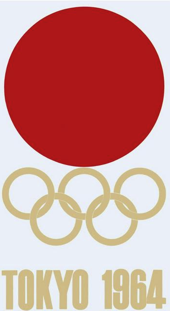
1964 Tokyo Olympic Games poster (photo: Ian Lynam)
Katsumi engineered a private logo competition for the Olympics with Inagaki Kōichiro, Kamekura Yūsaku, Kōno Takashi, Nagai Kazumasa, Sugiura Kōhei and Tanaka Ikkō pitted against one another in a winner-takes-all fashion. Kamekura’s modern logo design was the winner—a stacked composition with a red circle at the top, the Olympic Rings rendered in gold in the center and bold, condensed characters that read “Tokyo 1964”, also in gold, at the bottom. (It was undoubtedly helpful that Kamekura has enlisted the help of his mentor Hara Hiromu in approaching the compositional and lettering aspects of the logo, though Hara’s contribution has been downplayed in most published histories.)
Kamekura was paid ¥250,000 (equivalent to around $2,000,000 at the time) for his four poster designs for the 1964 Olympics, though he had to pay out three-quarters of the commission to the photographer Hayasaki Osamu and director Murakoshi Jo for coordinating the eighty-plus strobe-lit photographs conducted in the dark, alongside other photographers. Kamekura walked away with the equivalent of $500,000 today for his labors. (Traganou 2011, 476)
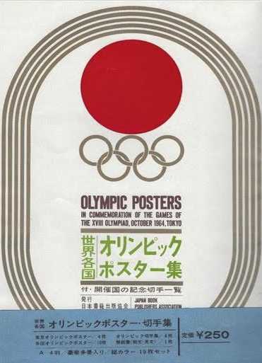
Packaging for 1964 Tokyo Olympic Games poster (photo: Ian Lynam)
Meanwhile, other designers would toil for months on the applied execution of the Olympic identity without pay, “Fukuda Shigeo, a member of the ‘symbol’ sub-committee, related that he had worked for three months without pay, and to make matters worse, was required to sign a document surrendering copyright privileges”. Fukuda and the other eleven members of the pictogram design team (including Tanaka Ikkō, Yokoo Tadanori, Uno Akira, Yamashita Yoshiro, Takimoto Tadahito, Hirohashi Keiko, Ejima Hitoshi, Uematsu Kiniomi, Harda Tadao, and Kimura Tsunehisa) assigned to the Olympics were paid “in-kind”, receiving only tickets to the Olympics for thousands of hours of collective labor.
The goal of the Tokyo Games was, as Japanese officials stated, ‘to show the world that Japan is not just a country of cherry blossoms and geishas . . . [but] to demonstrate that Japan had been rebuilt after the war and . . . willing to connect itself to the western world’. (Collins, ‘“Samurai” Politics’, 364.) The design for the 1964 Olympics eschewed the stereotypical imagery that Japan had been saddled with previously, incorporating aesthetics that were reductive, streamlined and profoundly modern instead. In many ways, the designs for the Olympics were a visual analogue for the profound changes that were happening in the country economically.
Kamekura and the members of both design teams were in a difficult position, being “interested in ‘representing Japaneseness’ even though they were ‘rejecting nationalism’” by designing the materials for the Japanese Olympics less than two decades after World War 2, helping to “reintegrate a national consciousness among the Japanese people, to restore continuity with the past and reawaken pride in Japanese culture”. (Kamekura 1971, 92).
1972 & 1998
As a private design competition had worked out so well two years prior, eight of Japan’s top designers were invited to submit proposals by Katsumi Masaru for the emblem design for the 1972 Sapporo Winter Olympics in 1966. Katsumi’s success with the design of the 1964 Olympics led to him being chosen to lead the prior visual design for the 1970 Osaka World Expo, the 1975 World’s Fair/World Expo in Okinawa, and a seemingly endless number of other globally-oriented events in Japan subsequently.
Of the thirty proposed designs submitted, one designed by Nagai Kazumasa was selected—a remixable kit of parts including the red circle from the Japanese national flag, a stylized bulbous snowflake, and the words “Sapporo ’72” set in tightly spaced all-caps sans serif letterforms.
Nagai’s logo was perhaps so successful due to its modular nature—the logo’s elements could be recombined into vertical and horizontal compositions, and with the inclusion of an event-specific additional graphic element, the parts could be stacked two-by-two variations using the same elements.
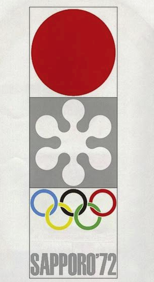
Detail of 1972 Sapporo Winter Olympic Games logo from brochure (photo: Ian Lynam)
For the 1998 Nagano Winter Olympics, the organizers took a different approach and hired branding and corporate identity specialists Landor Associates. This direction still resulted in an internal design competition with over 100 employees globally submitting over 1,000 potential logo designs.
After Landor’s creative leads boiled the selection down to three final possible logo contenders, the veritable gold was handed to Shinozuka Masanori for his mark—a multi-color-petalled flower featuring six abstract figures and their shadows seemingly dancing over a snowy background, which were purported to be individuals participating in winter sports. Landor would extend the identity for the Nagano Winter Olympics by designing four snow owl “Snowlet” mascots named Sukki, Nokki, Lekki and Tsukki representing fire, air, water and earth, while somehow simultaneously representing the four main islands that comprise Japan.
From 2020 to Infinity
When the Olympics and Paralympics returned to Japan for Tokyo 2020, the Japanese organizers put together a private competition that drew 104 entries from a selection of designers picked according to whether they had won specific design awards. This private competition yielded a modular red, gold and black design for the Olympics and Paralympics designed by Hakuhodo-associated designer Sano Kenjiro.
Sano had previously won the 17th Kamekura Yusaku Design Award, named after the designer of the 1964 Olympic logo. The website that catalogs past winners of this award quotes Sano as saying “Seeing (Kamekura’s 1964 Olympic logo) made me want to do work someday that’s simple and “big-boned” like that, work that would leave Japan – leave the entire world – speechless with awe. That’s the kind of design I want to create, I thought, even if only once in my lifetime: work that’s simple, clear and bold.” (JAGDA 2014)
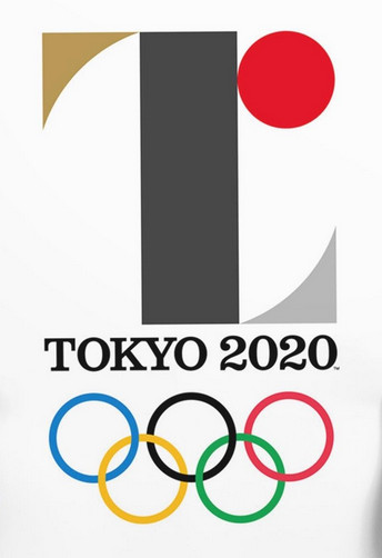
Crop of initial 2020 Tokyo Olympic & Paralympic Games poster to exclude copyrighted corporate logos (photo: Ian Lynam)
“Simple” would definitely be the primary term to define Sano’s logo system that was presented to the world in 2015—created using a few relatively primary shapes, the logo was only in circulation for about a month prior to accusations of plagiarism being levied at the designer behind it. The initial volley came from Belgian designer Olivier Debie, who publicly decried that the 2020 Olympic logo was cribbed from a logo that he had designed in 2011 for the Belgian government owned Théâtre de Liège. (Montgomery 2015)
Further allegations compared the Olympic logo to a mark designed by the late German/Swiss typographer and designer Jan Tschichold, one of the founders of Modern typography—what evolved into the de-facto visual language of contemporary global corporate aesthetics—most notably in that Sano’s mark neatly mirrored the design of an exhibition of Tschichold’s work by fellow Japanese designer Shirai Yoshihisa which had been exhibited at Ginza Graphic Gallery in 2013. The similarities were striking in regard to the deployment of specific shapes, as much as color, as Shirai’s work was a study in black, white and gold and employed a modular, recombinant approach to the rectangle, triangle, circle, and rectangle with one curved corner radius used for all of the exhibition’s promotional materials. (Ginza Graphic Gallery, 2013)
Debie wound up suing the International Olympic Committee, but subsequently dropped his lawsuit, citing exorbitant legal fees. As for Shirai, no legal action was pursued, yet by September of 2015, enough public relations damage was done. The Tokyo Olympic Design Committee recalled Sano’s logo.
Within two weeks, the Tokyo 2020 Emblems Selection Committee organized a public logo design competition for the design of the Olympics and Paralympics. The prize money was far from lavish: a mere ¥1,000,000 (just over $8,000 in US currency at that time) for an event which would have assorted corporations operating on different sponsor levels, as well as the Japanese national and Tokyo municipal governments pumping billions into the 2020 Games.
There were 14,599 entries initially submitted by the general public—only individuals over the age of 18 residing in Japan were allowed to apply, with exceptions made for children under the age of 18 who could submit designs as part of a group submission if the group included an adult residing in Japan over the age of 18. The initial 14,599 entries were winnowed down to 10,666 in a “Format Check” to ensure that all submissions were legally compliant. Next was the “First Design Check,” in which the remaining entries were “evaluated from a design perspective by a group containing a small number of people,” according to the official Olympic web page associated with the selection process. This resulted in the submitted proposals being narrowed down to 311 options. The next stage, the “Second Design Check,” was “conducted by a group containing a large number of people,” with 64 valid entries remaining. An “Evaluation by the Emblems Selection Committee” was conducted thereafter, wherein the 20-member Selection Committee whittled the entries down to four remaining options, each shortlisted and announced publicly. Within two weeks, on April 25, 2016, the winning finalist logo was announced.
The winner of the speculative labor-based design competition for the Olympics and Paralympics logo redesign was Tokyo-based artist Asao Tokolo. Asao was paid ¥500,000 per logo, as advertised—a paltry figure compared to what a professional design fee would be for a project of the scale and scope of the Olympics. As for the 14,598 others who dedicated their time to submissions for the 2020 Olympic and Paralympic emblem design competition: they spent innumerable hours of their lives working for nothing.
Cultural hairdressing
Derisive viral graphics began circulating around social media around the time of this initial design competition, most notably this mocking twee local neighborhood nursery school-like sendup of the state of the 2020 Olympics.
In November of 2015, I published an essay in English called “Why We Should Really Be Concerned About the Visual Identity for the Tokyo Olympics” and a week later, I published it in Japanese under the title, “なぜ東京オリンピックのビジュアルアイデンティティーを真剣に考える必要があるのか”. The concluding paragraphs of the essay follow:
“The Tokyo Olympic logo design competition is an example of speculative labor. It is the promotion of free labor and the devaluation of design as a sector of cultural production. Most likely, hundreds to thousands of individuals—including both laypeople and trained graphic designers—will submit logo designs to this competition. The Olympics, a for-profit entity flush with finances and gigantic sponsors, is asking for handouts.
Design competitions underlie cultural misunderstandings of design. The 1972 Olympic identity was great because it was designed from the ground up. The 2020 Olympic identity will merely be a piece of cultural hairdressing.
It is based on a wildly unprofessional relationship (the handout) and the fee for the winning design is wildly under professional standards in terms of payment.
The Tokyo Olympic logo design competition as speculative labor represents the further collapse of labor structures in the Neoliberal Era. It’s probably just a bit of social media entertainment for many, but it is representative of something larger — graphic design, a relatively new sector of cultural production the name of which was only coined in 1938 — is threatened not only by the ubiquitous accessibility of ‘creative’ software and by contemporary notions that ‘anyone can be a designer’, but these notions are now being given further form by powerful global events.
The history of the Olympics is one of war — of idle armies training in times of peace. To me, a graphic designer operating from a position of married theory and practice, the 2020 Tokyo Olympic logo design competition represents the most vehement bifurcate embodiment of anti-intellectualism and anti-labor sentiments.
This competition is a retreat from past greatness and toward a dystopian future—not just for design (and designers), but for the public as well.
And worst of all, us Tokyo residents, we’re going to be stuck with this symbol for the next five years—a symbol of a crowdsourced future.” (Lynam 2016)
The devalued labor that I felt the Tokyo Olympic logo public design competition represented was neatly mirrored in a publicly published letter on December 8th from Richard Grefé, then-Executive director of AIGA, the United States’ primary organizing body for graphic design. For 24 hours, AIGA’s website was reduced to a single page addressing Yoshiro Mori, president of the Tokyo Olympic Organizing Committee. The letter began with this paragraph:
It has come to our attention that you have launched a crowd-sourced competition to design the emblems for the Tokyo Olympics 2020. As the largest and oldest professional association of communication designers in the world, AIGA would like to urge you to reconsider this course.
AIGA’s missive was ignored, as were the countless media stories generated by designers’ discontent. The logo design competition trundled along, and Japan has been swathed in the mediocre visuals that the competition resulted in ever since, the blue-and-white lobster bib-like anti-pattern of Tokolo’s design.
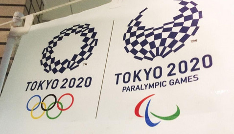
Crop of 2020 Olympic and Paralympic emblems from banner outside Shibuya Sports Center (photo: Ian Lynam)
The social media frenzy of the public design competition inspired the Olympic committee to create another public competition for the design of the 2020 Olympics and Paralympics mascots. Payment was never published online, making the monetary figure associated with the competition very pointedly not shared with the public after the fiasco that was the logo design competition.
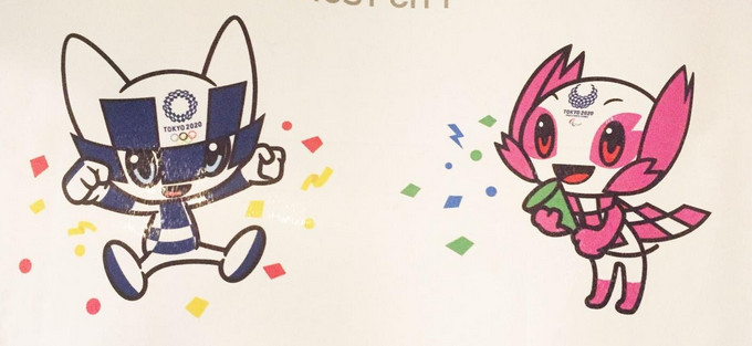
Crop of 2020 Olympic mascots from banner outside Shibuya Sports Center (photo: Ian Lynam)
The judges of the mascot competition? None other than the top aesthetes of the nation, notably a selection of elementary school classes. How that played out is quite literally anyone’s guess, as quantitative documentation is not available.
Not content to literally infantilize design-based decision-making, the Olympic organizing committee hosted yet another design competition for the Olympic medals. This time, even less information as to jury and remuneration was published, though apparently the heavy metals that the medals would be made from were sourced from used cell phones. (Etchells 2017)
The course of the 2020 Olympics has shifted my ideologies rather resolutely. I used to be a punky “I don’t really dig team sports” kind of person, just due to my involvement with subculture, but witnessing the wholesale devaluation of labor of not only so-called “creative” industries, something the nation of Japan supposedly prides itself on, but also the mobilization of Japan’s adult citizenry and its children’s time to countless, countless hours of labor spent and wasted, suggests something far, far more insidious.
The history of exploitative labor practices associated with this international event stretches back to the advent of the Games in Japan. The 2020 Tokyo Olympics has an unofficial sport attached to it: speculative labor. I’d mutter the phrase, “Let the games begin” under my breath, but my breath has already been stolen by the inherent spectacle… and the games have already been underway, whether the public is aware or not.
References:
Collins, Gail, 2007. “’Samurai’ politics: Japanese cultural identity in global sport – The Olympic Games as a representational strategy”, The International Journal of the History of Sport, Volume 24, Issue 3. Page 364.
Collins, Sandra. 2007. The 1940 Tokyo Games: The Missing Olympics: Japan, the Asian Olympics and the Olympic Movement. London, Routledge, 2007. Pages 956–964.
Etchells, Daniel. “Tokyo 2020 launches Olympic and Paralympic medal design competition”, Inside the Games, London: Dunsar Media Company Ltd. December 22, 2017. Accessed January 20, 2020.
Ginza Graphic Gallery, 2013. “Ginza Graphic Gallery website 2013 event schedule”. Ginza Graphic Gallery, Tokyo: Dainippon Printing. Accessed January 21, 2020.
Grefe, Richard. “Against Crowdsourcing Logo Design: an Open Letter From AIGA to the Tokyo Olympic Committee”, AIGA Eye on Design, New York: AIGA, December 8, 2015. Accessed January 20, 2020.
Hara, Kenya, 2020. “My first design proposal for the 2020 Tokyo Olympic Games”. Tokyo: Nippon Design Center. Accessed January 21, 2020.
Japan Graphic Design Association, 2020. “The 17th Yusaku Kamekua Design Award”. Japan Graphic Design Association. Accessed January 21, 2020.
Kamekura, Yūsaku,1971. Yūsaku Kamekura: His Works. Bijutsu Shuppan-sha, Tokyo, 1971. Pages 44–87.
Kyodo News Service, 2016. “Belgian designer drops suit over Tokyo 2020 Olympics logo, cites legal costs”, The Japan Times, January 27. Accessed January 20, 2020.
Landor Associates, Inc.. “Landor at the Olympics”. Landor.com. Tokyo: Landor. Accessed January 21, 2020.
Lynam, Ian, 2015. “Why We Should Really Be Concerned About the Visual Identity for the Tokyo Olympics”, Medium.com, November 26. Accessed January 20, 2020.
McCurry, Justin, 2015. “Tokyo 2020 Olympics logo scrapped after allegations of plagiarism”, The Guardian, September 1. Accessed January 21, 2020.
Montgomery, Angus, 2015. “Plagiarist or not, Tokyo 2020 designer Kenjiro Sano doesn’t deserve this treatment”, London: Design Week, September 2. Accessed January 21, 2020.
Murai, Shusuke, 2015. “Design by architect Kengo Kuma picked for Tokyo’s new Olympic stadium”, Japan Times, Dec. 22.
Netama. “もう東京オリンピックのデザインはこれでいいんじゃないかな”, Netama, August 21, 2018. Accesses January 20, 2020.
Niggli Verlag. “Sapporo 1972 – Emblem”. The Olympic Design.com. Switzerland: Niggli Verlag. Accessed January 31, 2020.
The Organizing Committee of the XIIth Olympiad. Report of the Organizing Committee on its work for the XIIth Olympic Games of 1940 in Tokyo until the relinquishment, Tokyo: International Olympic Committee, 1940. Accessed January 20, 2020.
Thornton, Richard, 1991. The Graphic Spirit of Japan. New York, Van Nostrand. Pages 98–112.
Tokyo Organizing Committee of the Olympic and Paralympic Games. “The mascots were chosen by the elementary school children’s voting.” Tokyo 2020. Tokyo: Tokyo Organizing Committee of the Olympic and Paralympic Games. Accessed January 20, 2020.
Tokyo Organizing Committee of the Olympic and Paralympic Games. “Tokyo 2020 emblems – selection process”. Tokyo 2020. Tokyo: Tokyo Organizing Committee of the Olympic and Paralympic Games. Accessed January 20, 2020.
Tokyo Organizing Committee of the Olympic and Paralympic Games. “Tokyo 2020 Olympic and Paralympic Mascot Design Competition Now Open to Public!” August 1, 2017. Tokyo 2020. Tokyo: Tokyo Organising Committee of the Olympic and Paralympic Games. Accessed January 20, 2020.
Traganou, Jilly, 2011.”Tokyo’s 1964 Olympic design as a ‘realm of [design] memory’”, Sport in Society, Volume 14, Issue 4: Remembering the glory days of the nation: sport as lieu de mémoire in Japan, pages 475–478.

